DESIGN
Logo Design
Brand Identity
Packaging Design
Marketing
PROGRAMS
Illustrator
Photoshop
DATE
2023
DESIGN
Logo Design
Brand Identity
Packaging Design
Marketing
PROGRAMS
Illustrator
Photoshop
DATE
2023
Chowbus
BRIEF
Chowbus is an Asian-centered food delivery app. Whether you're craving ramen, bibimbap, or tanghulu, Chowbus is your go-to for when you're feeling like eating something delicious. I created a redesign concept focused on recognizable Asian food imagery.
BRIEF
Chowbus is an Asian-centered food delivery app. Whether you're craving ramen, bibimbap, or tanghulu, Chowbus is your go-to for when you're feeling like eating something delicious. I created a redesign concept focused on recognizable Asian food imagery.
CHALLENGE
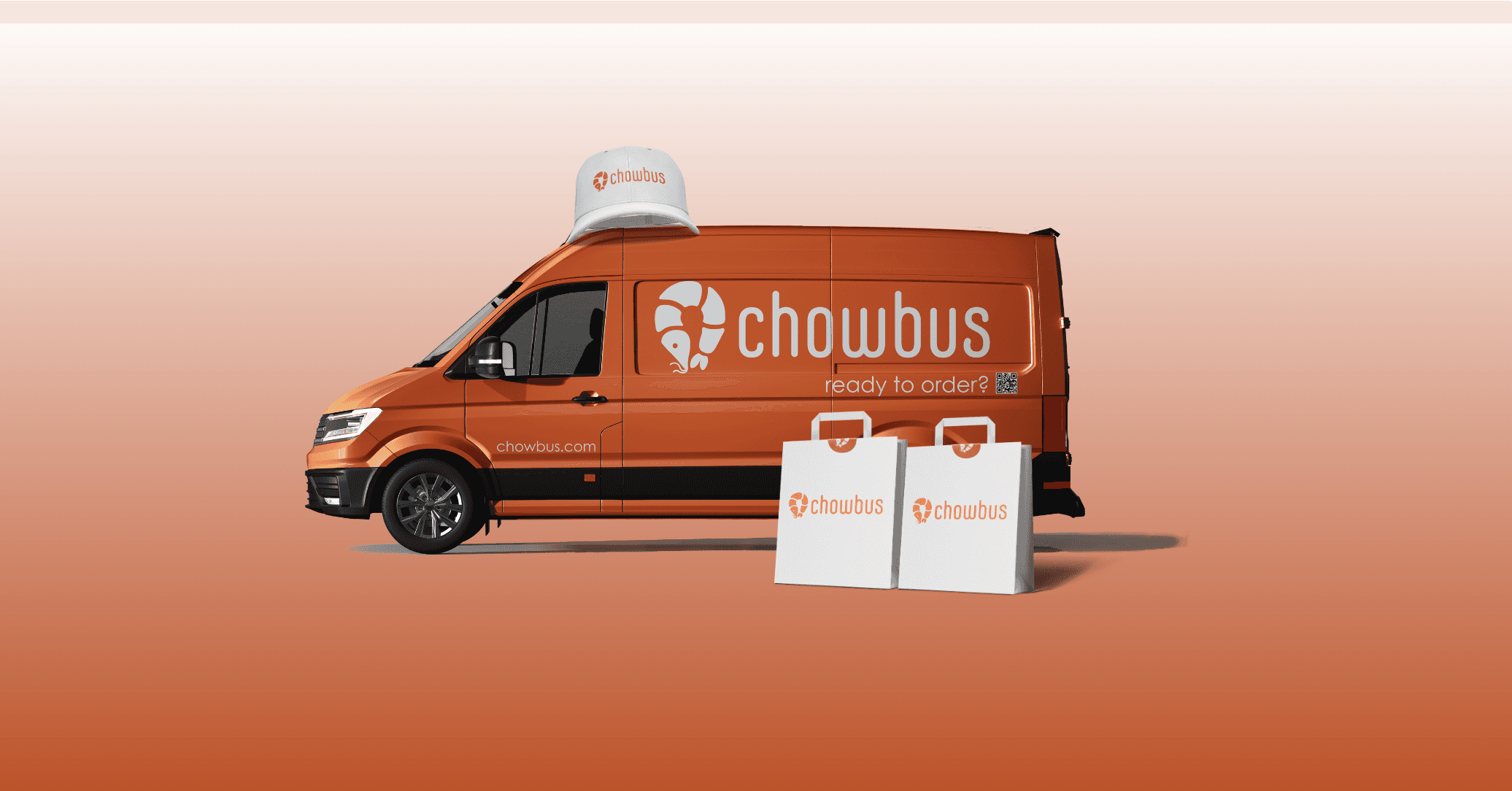
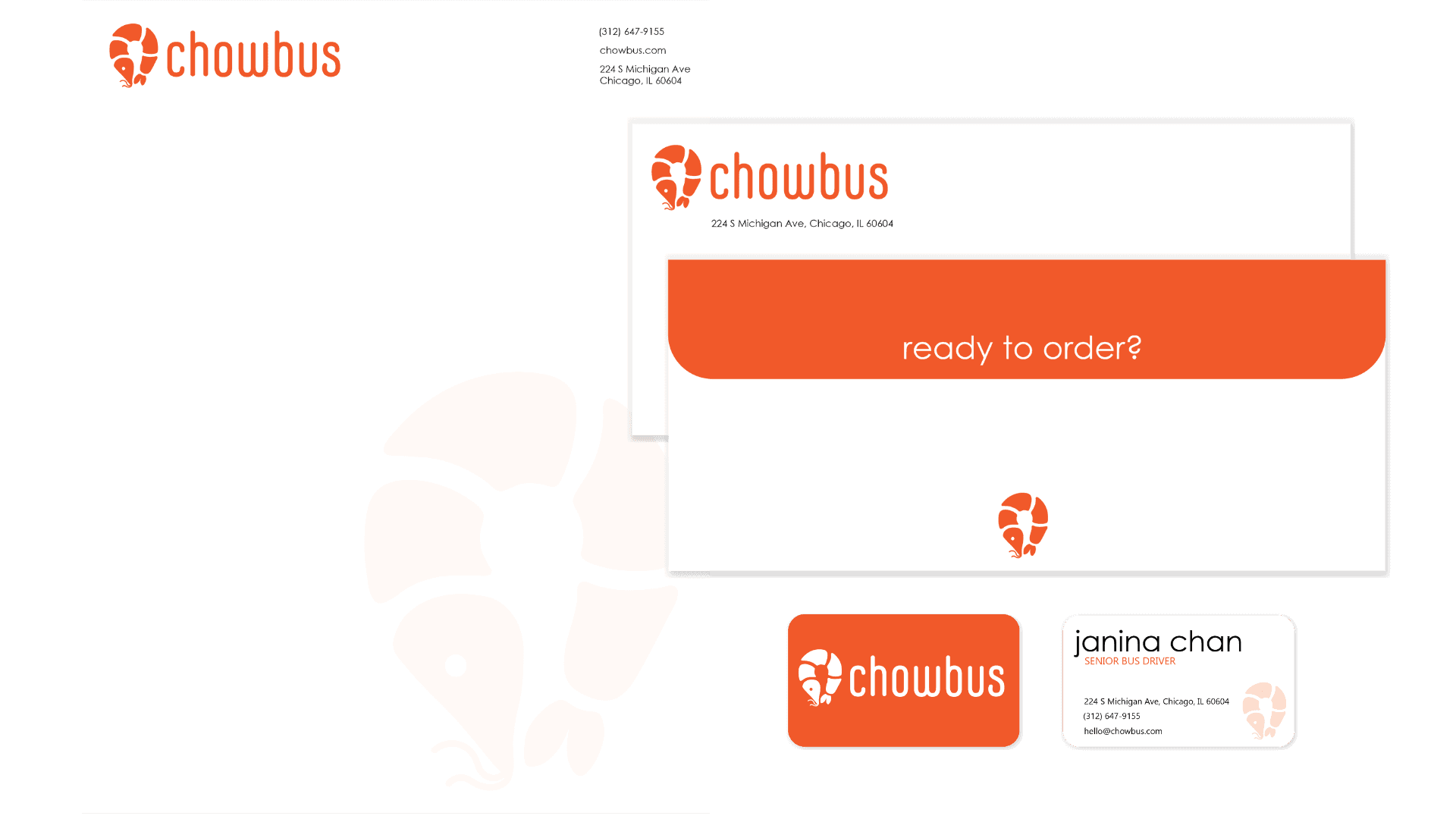
How can I design a concept logo for the Asian food delivery service, Chowbus, and maintain consistency across all brand collateral, from vehicle wraps to letterheads?
CHALLENGE
How can I design a concept logo for the Asian food delivery service, Chowbus, and maintain consistency across all brand collateral, from vehicle wraps to letterheads?
SOLUTION
I focused on iconic Asian food imagery, combined with location symbolization. The shrimp, a universally well-known ingredient in many Asian cuisines, creates the map marker shape. I ensured that the logomark was familiar across all collateral, aiming for recognizable colors and imagery.
SOLUTION
I focused on iconic Asian food imagery, combined with location symbolization. The shrimp, a universally well-known ingredient in many Asian cuisines, creates the map marker shape. I ensured that the logomark was familiar across all collateral, aiming for recognizable colors and imagery.


PROCESS
I began this project by researching iconic Asian foods and symbols. I wanted to showcase the Asian-forward aspect of Chowbus, so I opted to explore symbols combining food and location/delivery. By utilizing a limited dual color palette, I could maintain consistency and color familiarity across all collateral.
LOGO EXPLORATION
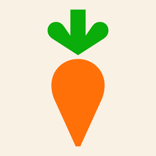
Early iterations of my logo exploration focused on "food on wheels", diving into a clear connection between the two. However, I turned towards a subtler approach with a combination between shrimp and a map marker.


PROCESS
I began this project by researching iconic Asian foods and symbols. I wanted to showcase the Asian-forward aspect of Chowbus, so I opted to explore symbols combining food and location/delivery. By utilizing a limited dual color palette, I could maintain consistency and color familiarity across all collateral.
LOGO EXPLORATION
Early iterations of my logo exploration focused on "food on wheels", diving into a clear connection between the two. However, I turned towards a subtler approach with a combination between shrimp and a map marker.
DESIGN
Logo Design
Brand Identity
Packaging Design
Marketing
PROGRAMS
Illustrator
Photoshop
DATE
2023
Chowbus
BRIEF
Chowbus is an Asian-centered food delivery app. Whether you're craving ramen, bibimbap, or tanghulu, Chowbus is your go-to for when you're feeling like eating something delicious. I created a redesign concept focused on recognizable Asian food imagery.
CHALLENGE
How can I design a concept logo for the Asian food delivery service, Chowbus, and maintain consistency across all brand collateral, from vehicle wraps to letterheads?
SOLUTION
I focused on iconic Asian food imagery, combined with location symbolization. The shrimp, a universally well-known ingredient in many Asian cuisines, creates the map marker shape. I ensured that the logomark was familiar across all collateral, aiming for recognizable colors and imagery.
LET'S GET IN TOUCH
Have a question? Interested in recruiting my talents?
Or just want to make conversation?
Don’t hesitate to reach out!
LET'S GET IN TOUCH
Have a question?
Interested in recruiting my talents?
Or just want to make conversation?
Don’t hesitate to reach out!
LET'S GET IN TOUCH
Have a question? Interested in recruiting my talents?
Or just want to make conversation?
Don’t hesitate to reach out!
LET'S GET IN TOUCH
Have a question? Interested in recruiting my talents?
Or just want to make conversation?
Don’t hesitate to reach out!
Wireframed/Designed in Figma, Built in Framer.
© 2026 Janina Chan. All Rights Reserved.
JANINA
CHAN
Wireframed/Designed in Figma, Built in Framer.
© 2026 Janina Chan. All Rights Reserved.
JANINA
CHAN
Wireframed/Designed in Figma, Built in Framer.
© 2026 Janina Chan. All Rights Reserved.
JANINA
CHAN
Wireframed/Designed in Figma, Built in Framer.
© 2026 Janina Chan. All Rights Reserved.
JANINA
CHAN
DESIGN
Logo Design
Brand Identity
Packaging Design
Marketing
PROGRAMS
Illustrator
Photoshop
DATE
2023
Chowbus
BRIEF
Chowbus is an Asian-centered food delivery app. Whether you're craving ramen, bibimbap, or tanghulu, Chowbus is your go-to for when you're feeling like eating something delicious. I created a redesign concept focused on recognizable Asian food imagery.
CHALLENGE
How can I design a concept logo for the Asian food delivery service, Chowbus, and maintain consistency across all brand collateral, from vehicle wraps to letterheads?
SOLUTION
I focused on iconic Asian food imagery, combined with location symbolization. The shrimp, a universally well-known ingredient in many Asian cuisines, creates the map marker shape. I ensured that the logomark was familiar across all collateral, aiming for recognizable colors and imagery.
PROCESS
I began this project by researching iconic Asian foods and symbols. I wanted to showcase the Asian-forward aspect of Chowbus, so I opted to explore symbols combining food and location/delivery. By utilizing a limited dual color palette, I could maintain consistency and color familiarity across all collateral.
LOGO EXPLORATION
Early iterations of my logo exploration focused on "food on wheels", diving into a clear connection between the two. However, I turned towards a subtler approach with a combination between shrimp and a map marker.
LET'S GET IN TOUCH
Have a question? Interested in recruiting my talents?
Or just want to make conversation?
Don’t hesitate to reach out!
LET'S GET IN TOUCH
Have a question? Interested in recruiting my talents?
Or just want to make conversation?
Don’t hesitate to reach out!
Wireframed/Designed in Figma, Built in Framer.
© 2026 Janina Chan. All Rights Reserved.
JANINA
CHAN
Wireframed/Designed in Figma, Built in Framer.
© 2026 Janina Chan. All Rights Reserved.
JANINA
CHAN
JANINA CHAN
JANINA CHAN
JANINA CHAN
JANINA CHAN